
Brand Rebuild, Premium Positioning, & Website
Client: Rich Insights Research
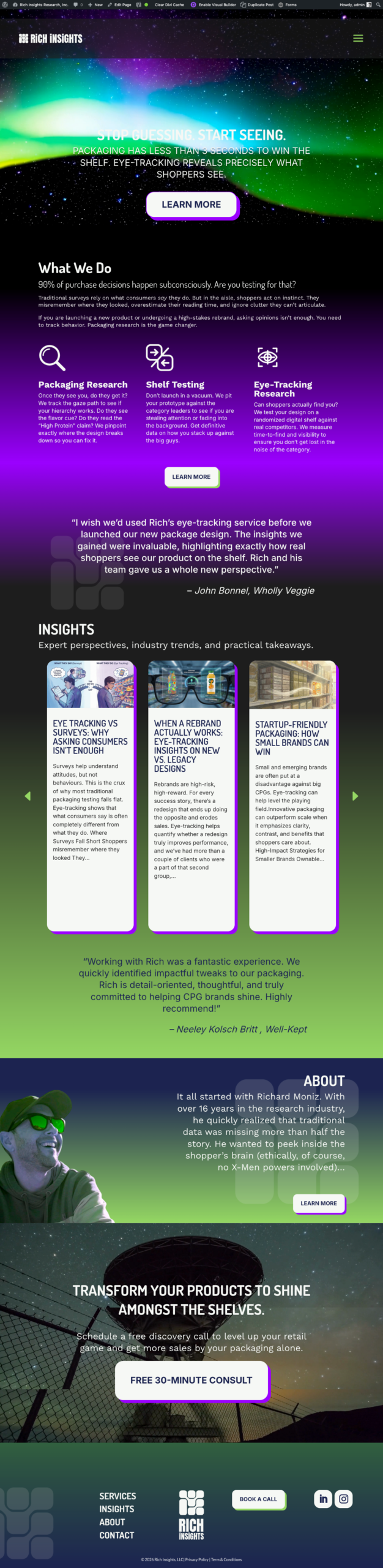
Work: Premium positioning, Brand identity, Logo, Color palette & style guide, Website build
The Situation
Rich Insights had practical capabilities in eye-tracking, shelf testing, and analyzing real shopper behavior. However, the brand read like a research vendor, not a premium partner that helps CPG teams make expensive packaging decisions with confidence.
The work was strong, but the signal needed more work.
The Goal
Make Rich Insights feel:
- Credible: Rich Insights uses serious methods and not just “marketing vibes.”
- Premium: This service is worth spending money on.
- Clear: Audience should know what Rich Insights does & why it matters in 10 seconds.
- Consistent: Creative standards across presentation decks, reports, website, etc.
- Launch: A website & brand that turns “interesting” into “let’s talk.”
What We Did
1) Premium positioning to capture attention fast
We framed Rich Insights around outcomes of profit certainty and decision confidence.
Core idea:
- Shoppers decide fast.
- Packaging either gets seen, understood, and chosen or it doesn’t.
- Rich Insights helps brands test before they gamble.
2) Brand identity built for trust (not decoration)
We built a full identity system designed to look sharp everywhere and stay consistent even when multiple people touch it.
Delivered:
- Brand voice & messaging themes (direct, confident, outcomes-first)
- Brand pillars and simple proof language that CPG teams use daily
3) New logo system that scales
We designed a logo suite that works across:
- Website & social
- Decks & reports
- Dark/light backgrounds
- Small sizes (where most logos die)
And we locked it down with clear usage rules so it doesn’t get “creatively interpreted” into nonsense six months later by a 3rd party.
4) Color & type system that reads as premium
We defined a palette and typography system that signals:
- Authority and rigor without being sterile
- Modern clarity that doesn’t slide into generic
- High contrast readability
This wasn’t “pick some pretty colors,” it was: make the brand feel expensive, trustworthy, and current.
Website Build
We translated the new positioning into a site that does one job: Make buyers understand the value fast and start a conversation.
Key moves:
- Clear headline & offer framing (what they do, who it’s for, why it matters)
- Services structured around real CPG questions (noticeability, findability, and comprehension)
- Content organized to build confidence in the knowledge and brand
- CTAs that don’t overcomplicate the ask
The Result
Rich Insights shows up like the partner they are; a decision-confidence partner for brands that don’t have time to guess:
- Clear offer
- Premium credibility
- Modern, consistent identity
- Website that supports conversions
INDUSTRY:
Consumer Packaged Goods (CPG)
LOCATION:
Bradford, Ontario, Canada
INVOLVEMENT:
Brand Identity
Verbal Identity
Content Development
Website UI Design
WordPressWebsite Development
Search Engine Optimization
– Richard Moniz, Founder, Rich Insights Research