
The Challenge
The name MC Flavors carried a “fast-food” energy, quick-serve, not craft. Their logo lacked structure and modernity. And while the company’s founder was offering world-class flavor science and culinary consulting, the brand wasn’t signaling that same level of expertise or value.
The challenge:
Reimagine the brand from the inside out, name, identity, voice, and digital experience to reflect who they truly are and attract the right clients.
The Strategy
Our goal was clear: elevate MC Flavors into something that felt smart, sensory, and sophisticated — without losing the human touch.
Through discovery, we uncovered a brand rooted in precision, creativity, and Italian sensibility. The founder’s craft sits at the intersection of art and science — balancing the chemistry of flavor with the intuition of a chef.
That’s where the new name came in: Nota Bene; Latin for “Good Notes.”
It’s both a nod to the client’s Italian heritage and a metaphor for the details that make flavor sing.
The Identity
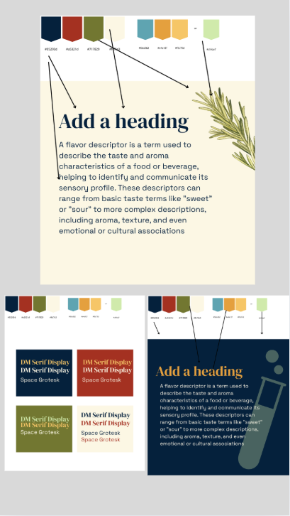
The new brand identity draws from mid-century modernism, clean geometry, confident typography, and balanced proportion, infused with the warmth of culinary craft.
The color palette mixes deep neutrals with subtle scientific tones, symbolizing both precision and palette. The logo itself delivers a sense of order and expertise, while remaining approachable and adaptable across packaging, digital, and environmental touchpoints.
The verbal brand follows suit: smart, approachable, and comprehensible.
No jargon. No pretension. Just flavor, expertise, and clarity.
The Launch
We developed a concise social and digital rollout announcing the transformation:
MC Flavors became Nota Bene Flavors; a brand reborn with purpose, clarity, and style.
The launch campaign focused on simplicity and intrigue — designed to capture attention from existing clients while inviting a broader audience of chefs, R&D teams, and product developers to take notice.
The Digital Experience
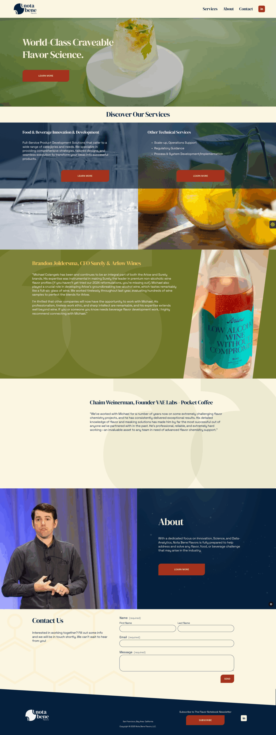
The redesigned Nota Bene Flavors website takes the user on a simple, intuitive journey with streamlined navigation, clear UX, and strong storytelling.
High-definition visuals showcase the building blocks of flavor- Salt, Heat, Acid, Sweet, Sour, Umami — in stunning detail, brought to life through custom hero video content.
Every touchpoint reinforces the idea that flavor is both an art and a science — a balance of curiosity, data, and delight.
The Impact
The rebrand ignited immediate momentum.
The client fell in love with the new identity, color palette, and storytelling potential, finally seeing his company represented with the precision and confidence it deserved.
Since launch, growth has accelerated rapidly.
New partnerships, new opportunities, and a stronger market presence have followed.
The Takeaway
You don’t have to be a big company to look precise.
Nota Bene proves that with innovative design, clear strategy, and an authentic story, even a boutique flavor science brand can look, feel, and perform like a world-class partner.
INDUSTRY:
Consumer Package Goods (CPG) Services
LOCATION:
San Francisco, CA
INVOLVEMENT:
Naming & Brand Identity
Verbal Brand Development
Brand Style Guide
Website Redesign
Hero Video Production
Social Media Launch Campaign
The team at Brandartica helped my consultancy business rename and rebrand. They were professional and easy to work with, but most importantly the final product was INCREDIBLE.
Since launching my new brand, my business has taken off and a huge piece is the creatives, website and brand identity. It all works together now and it’s all thanks to the team at Brandartica!
– Michael Colangelo, Founder